The Packaging
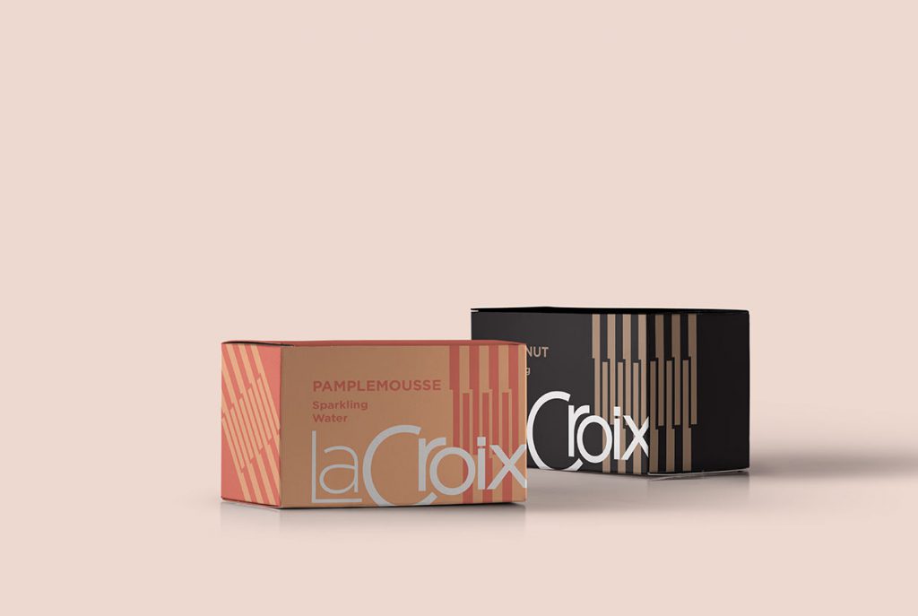
I wanted the packaging to use plain cardboard as a color and I wanted to implement a pattern made from a single shape. The logo spills over the edge of the box to give a bigger feeling.
Creating contrast between the logo and the rest of the box helps it stand out on a shelf. Each box would have colors that represent the flavor, alternating which elements are added color and which are natural cardboard.

The Can

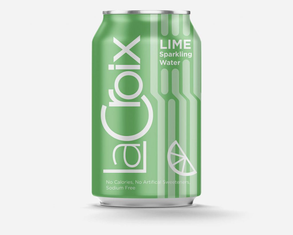
The can has a similar pattern to the boxes. I wanted to use simple shapes as much as possible.
The color of the can as well as the iconography at the bottom represent the flavor.
Of course no can of LaCroix would be complete without the following phrase: “No Calories, No Artificial Sweeteners, Sodium free.

The Ads
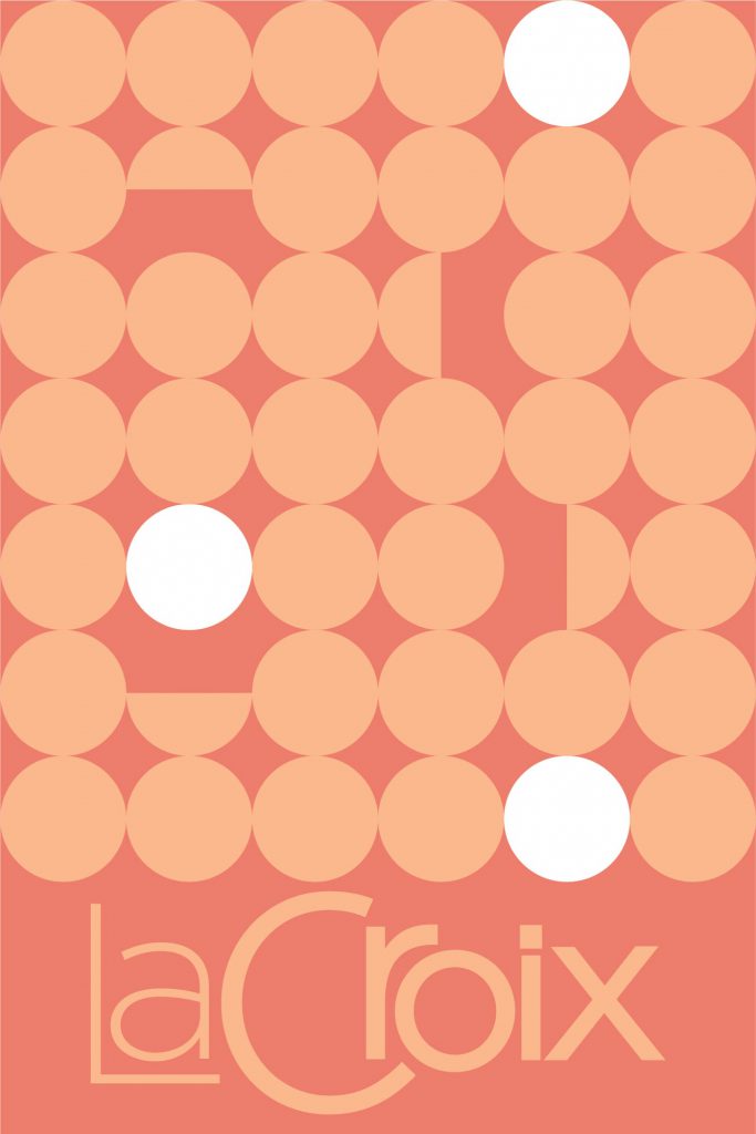
I made this poster as an advertisement for a rebrand rather than for the product. Most people that drink carbonated water knows what LaCroix is. A simple and beautiful framing of the rebrand might coax both loyal drinkers of LaCroix as well as those who buy from the competition.
The dots subtly represent bubbles with the semicircles representing bubbles bursting. The white dots give a feeling of upward motion. The colors of the poster are what I would use for the “Pamplemousse” flavor (grapefruit), one of my favorites.
This was one of my favorite projects from my graphic design certificate at The New School.
Check out some other branding.
The Logo
The logo is a major departure from the LaCroix brand opting for a more modern and minimal aesthetic. I wanted to experiment with a completely different approach in my rebrand.
Here is an all black version of the logo. I wanted it to give a feeling of effervescence just like the product it represents.