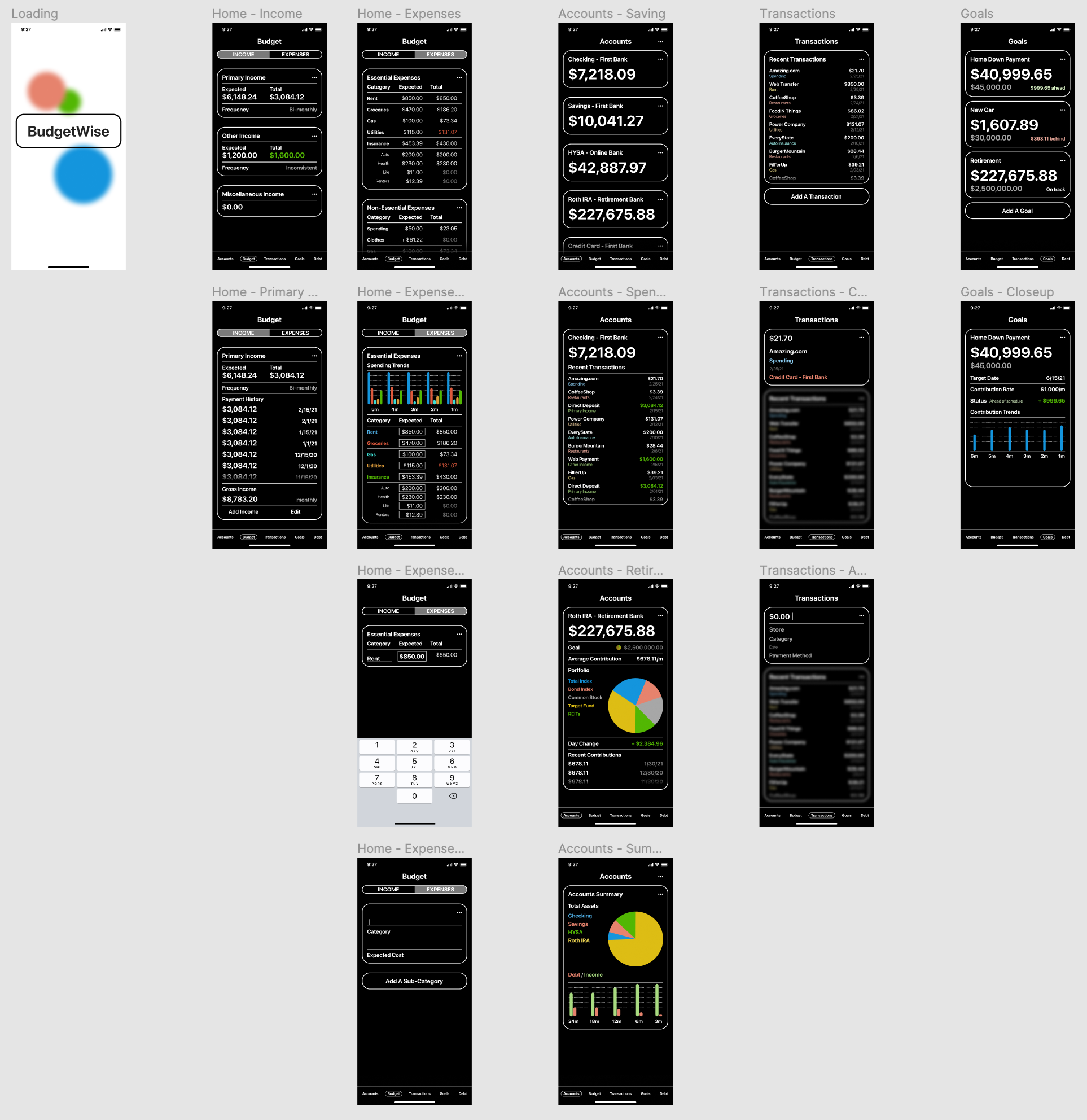
BudgetWise is an app designed to give users a clear approach to their money. They’re able to see all their money in all the places where it’s kept. They’re able to use as many categories and subcategories for their income and expenses as they want. And they’re able to view it as simply or as detailed as they need to.


I designed and prototyped BudgetWise using Figma. My goal was to create a budgeting app that gave the user as much control over how they saw their money. Rather than forcing the user into specific categories and ways of tracking their income and saving, BudgetWise gives flexibility.
The user is able to break up things like income and expenses into as many categories and subcategories as they need. This allows those with inconsistent income to have a consistent idea of what their money is doing. Tracking goals and looking at the details gives the user insight into where their money is going and they’re able to have a better idea of the future of their money.
I wanted to the design to be simple, highlighting the information and not distracting the user with an overly designed interface. Money can be overwhelming for people, presenting it as clearly as possible allows the user to focus. Being able to simplify their view means even complex categories can be understood.
This UX/UI project gave me an opportunity to explore mobile app design and gain a better understanding of what can be done with Figma.

Prototyping this project meant building out every page I could foresee being used in the app.

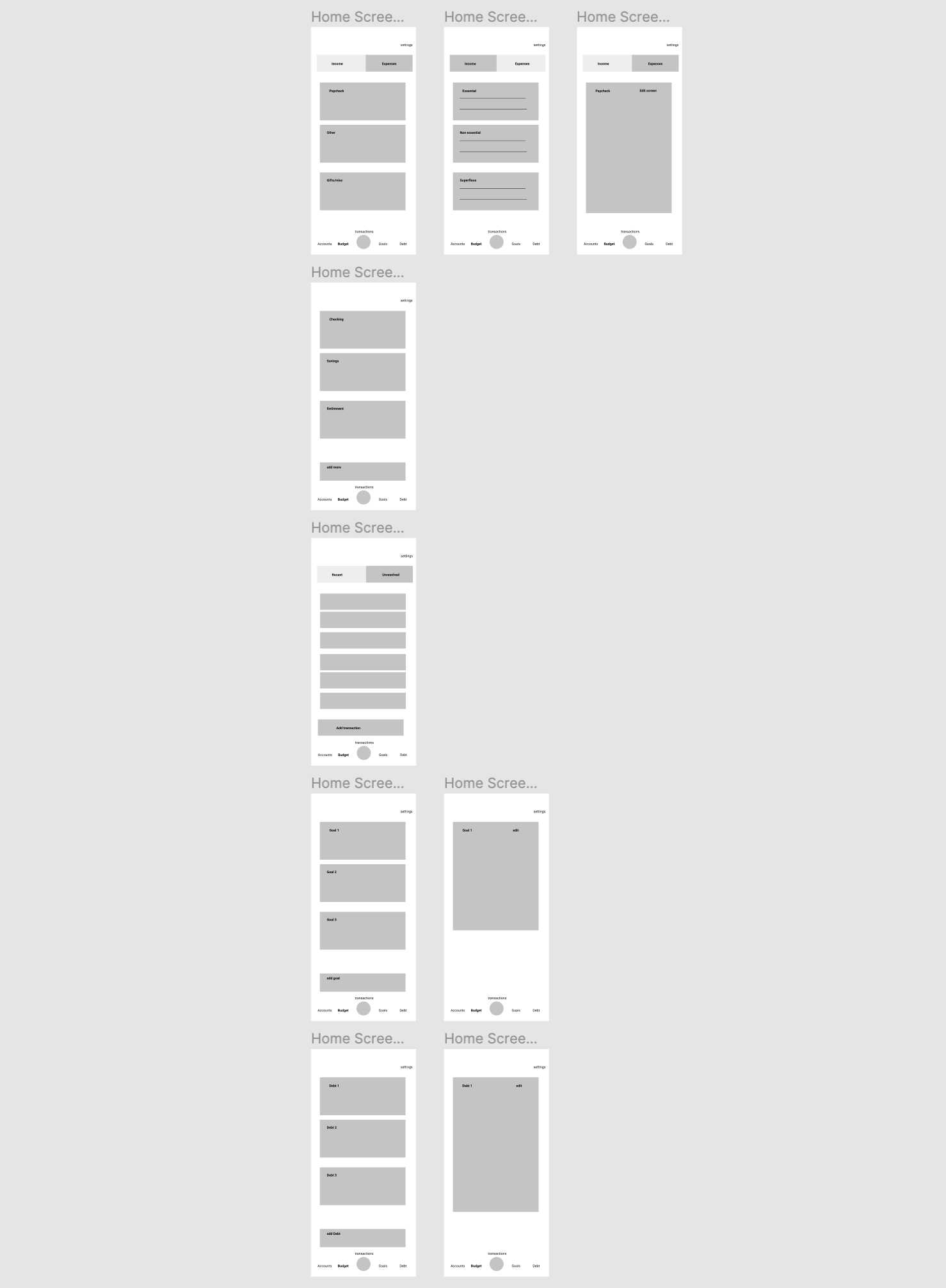
Before I could get to designing each of these pages I needed to work out the UX flow with wireframes.

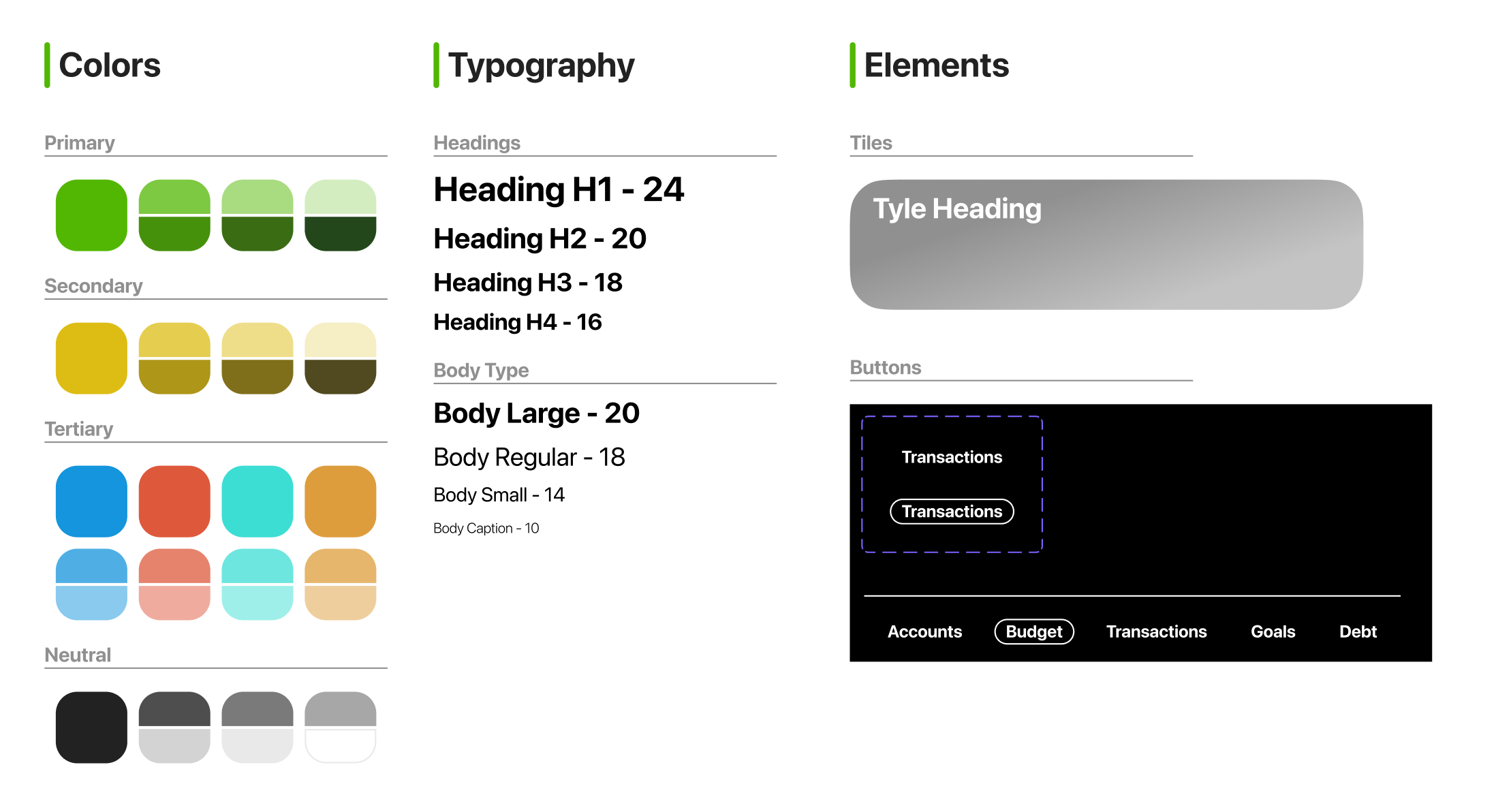
Once the user flow was more clearly defined I started working on my color scheme and design elements. This system meant that I could save time and remain consistent across the whole design.
