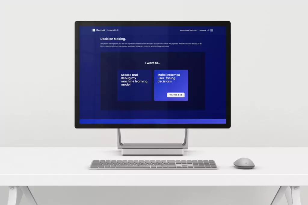
I worked on a project for Microsoft Responsible AI under the creative direction of Tarik Nally at Kale & Flax. responsibleaitoolbox.ai is a resource for developers to make artificial intelligence more responsible and accessible. Our target user is a developer who’s familiar with developing for AI and is looking to improve their skills with open source resources.
UX research and wire framing
There were two specific categories that informed our design, usefulness and familiarity. The site was meant to be a tool, and so as much as we tried to make it beautiful and fun, first it needed to be useful, functional, and helpful. We thought through how the user would walk through more complex terms and concepts without getting fatigued or distracted.
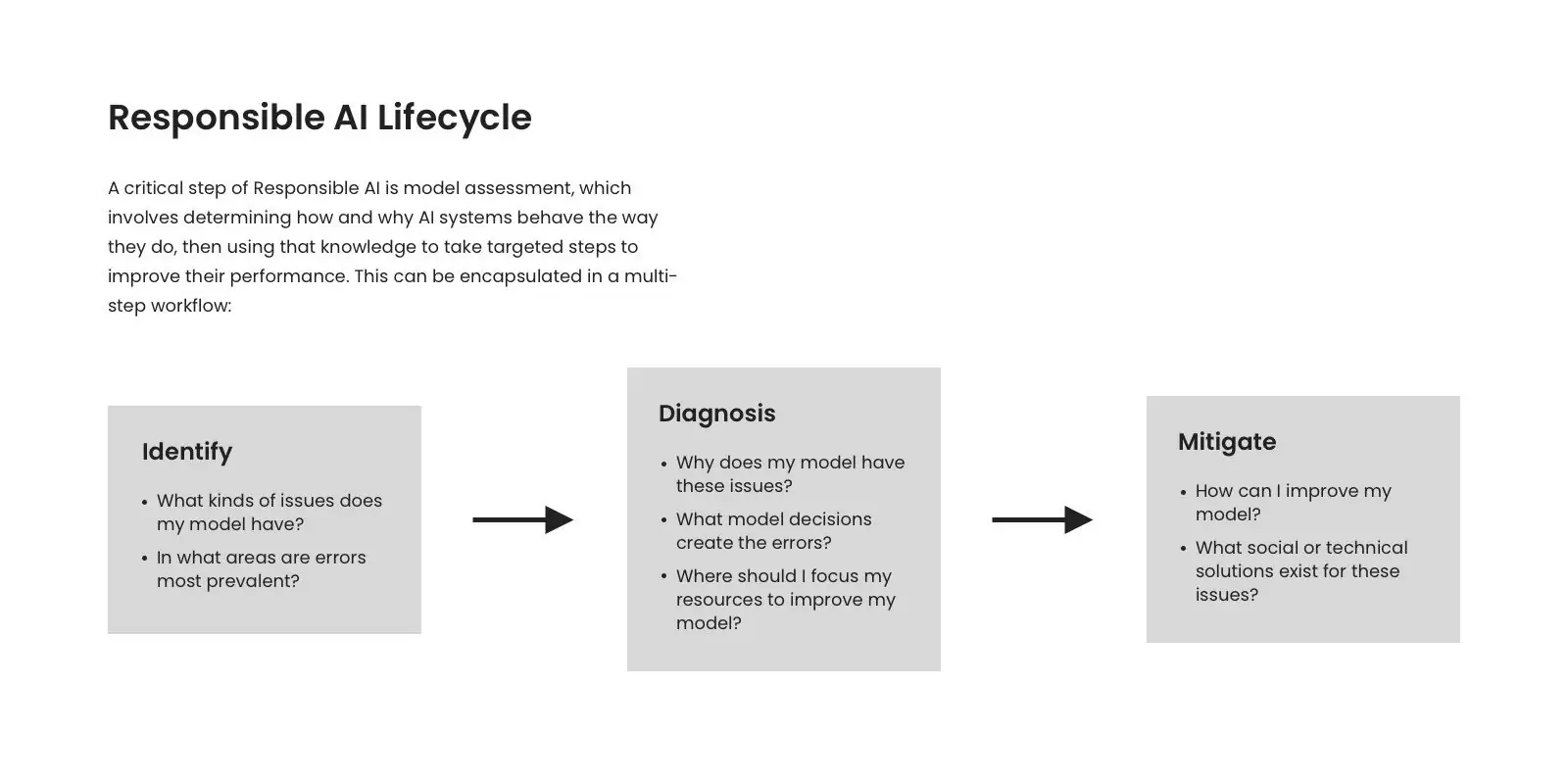
We wanted to differentiate between different tools, steps, and concepts in ways that kept things from getting muddled. Since this is a tool for education and problem solving we anticipate that more than a few users will arrive a little frustrated with their process, we don’t want to add to that but relieve any stress.
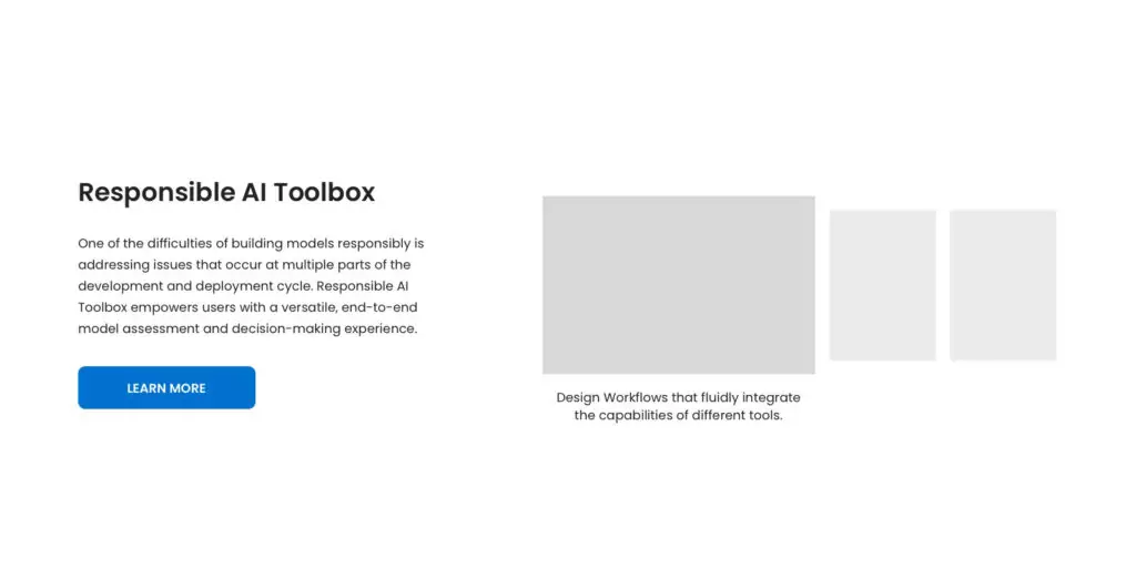
UI and illustration
Once we felt good about the way the site was going to flow we leaned into familiarity a little more. We looked at sites like stackoverflow.com, GitHub, and others that users would be familiar with. We wanted this to not feel the same, but feel familiar. Like moving between related software as opposed to switching between operating systems. We decided a dark theme would be most welcoming to the weary eyes of late night coding sessions and leaned into Microsofts blue tones which are welcoming and calming.
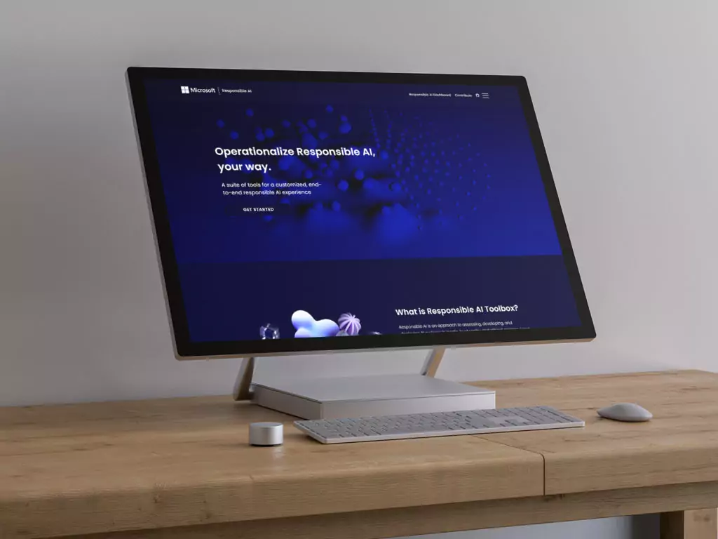
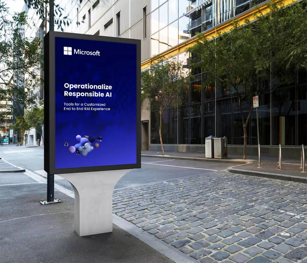
We reached out to one of Kale & Flax’s favorite illustrators, Lisaly to create some ethereal, futuristic, 3d illustrations.
We also developed a quiz to direct users to resources that would be most likely to solve problems and answer questions. We avoided the assumption that most users are thoroughly familiar with developing from AI and opted for a welcoming approach that would lift users starting with the lowest common denominator.
