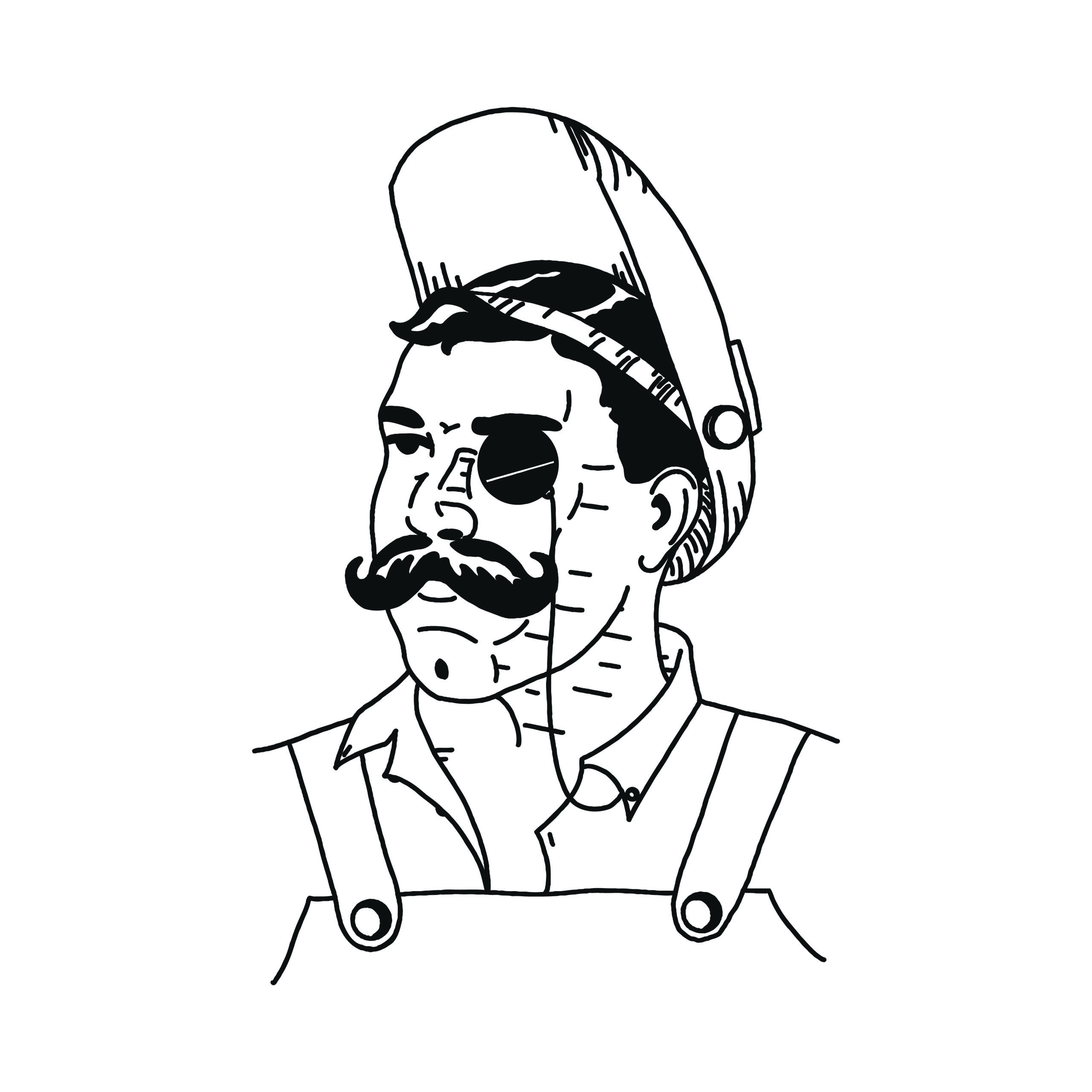
A local fence builder and welder approached me with a vision for a branding overhaul. His existing logo was more or less a clipart version of what he hoped to have. A welder, with a mustache, wearing a monocle. The picture captures the ethos of the business owner but the style fell short. He wanted a logo designed in the style of a 1940’s comic illustration as exampled below.


It took several attempts and some experimentation before I felt I was acquainted enough with the illustration style to present a piece that would accurately represent the clients vision.

The final product is went through a few versions of revising the illustration and putting it through some editing in photoshop and illustrator. I wanted it to have the appearance of having been hand drawn but I wanted to be sure it was clean enough to operate at smaller sizes.

You can see other projects on Behance. Or you can check out another branding project here.
