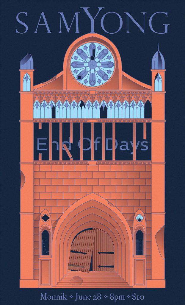
Finished Poster
The concert poster shows a cathedral in a state of decay with broken windows, crumbling stone, and a door hanging off busted hinges. Cathedrals generally represent longevity and age, showing one in this state seemed to represent the concept of the “End of Days” pretty well.
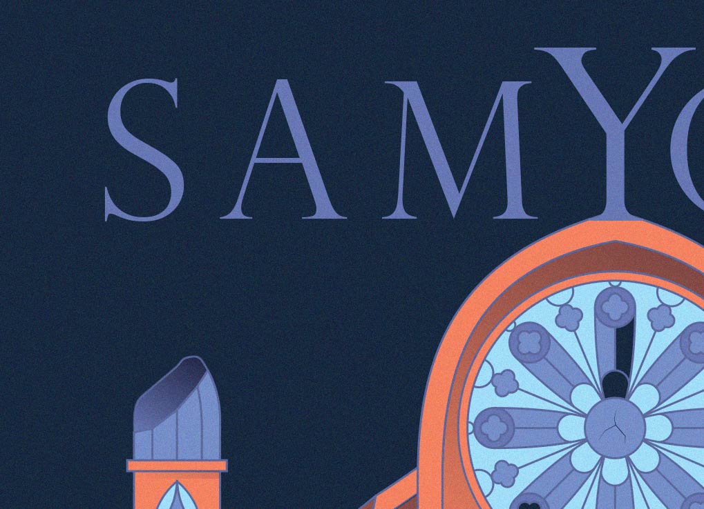
I stuck with pretty simple complementary colors that were just a little abstract. Choosing elements from several different photos of cathedrals that I found made this project far easier. I wanted the glass to be somewhat ornate but not so much so to distract from the rest of the artwork. Taking from the architecture of Gothic cathedrals the artwork draws the eye upward. This lended well to the typographic hierarchy.
The typeface for “End Of Days,” seen here is different from the original poster. After a few months of looking at it I decided I didn’t like the original typeface.
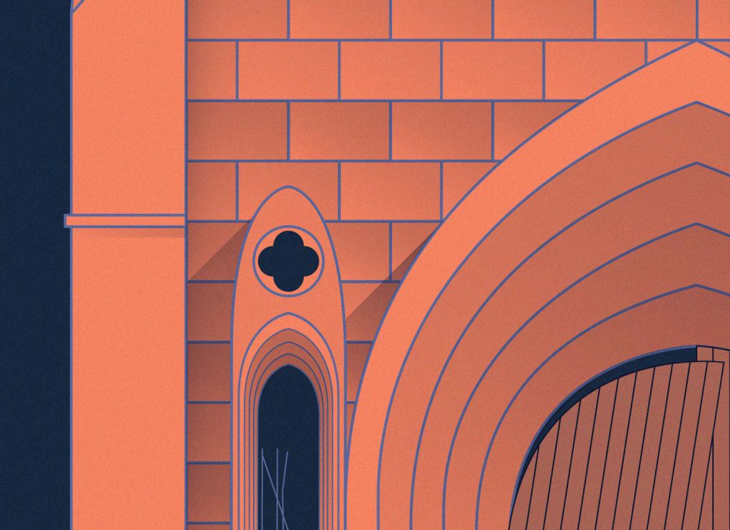
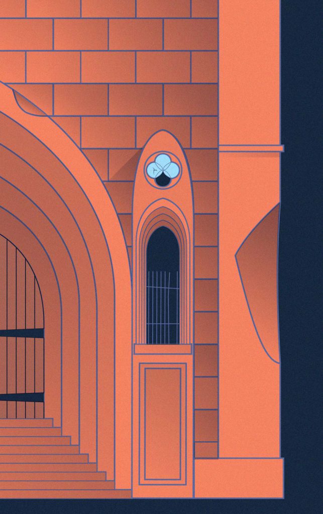
The concert poster is mostly straight lines and solid colors. I added an even texture to the whole poster to allow the cathedral to feel aged and organic. I wanted to accomplish this without messing with the style. Each of the individual shadows add another subtle texture to create more contrast without adding new or darker colors.
Nearly every shape has its own shadow, even the bricks seen in this photo. This took a whole lot of time but added depth to the illustration. Using many shades of the same colors kept things simple without being boring.


You can check out Sam’s music on Spotify or wherever you stream music. See some more illustration here.