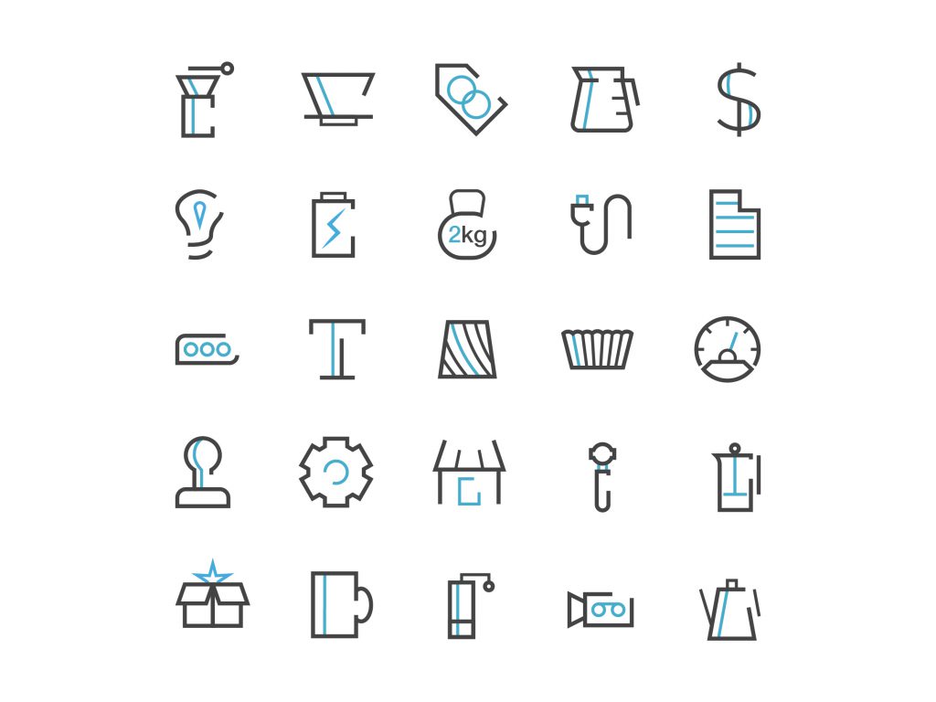
Final Icon Set
The final icon design set is clean and works great at multiple sizes. We wanted something that we could use to display an idea at a relatively large scale to help highlight the features of a product but we wanted the style to be simple enough for use on mobile as well as in navigation on the site. We also wanted to go with a two color set so that we could communicate more with fewer pixels given how little real estate we would be working with. The icon set is still being expanded as new icons are needed.
Icons on mobile
The icon set visualizing the features of a product. Icon design for these product features was identical to the UI elements on the site.
The icon set works well on mobile with small icons throughout the website but also works great at much larger sizes. Each icon was designed to be infinitely scalable so that we would have flexibility with how they were implemented in the future.
The icons in this image show some key features of a pouring kettle. Each icon visualizes the unique features in a descriptive way that is easy to skim. However, upon closer inspection each icon is painstakingly designed to display well at any size.
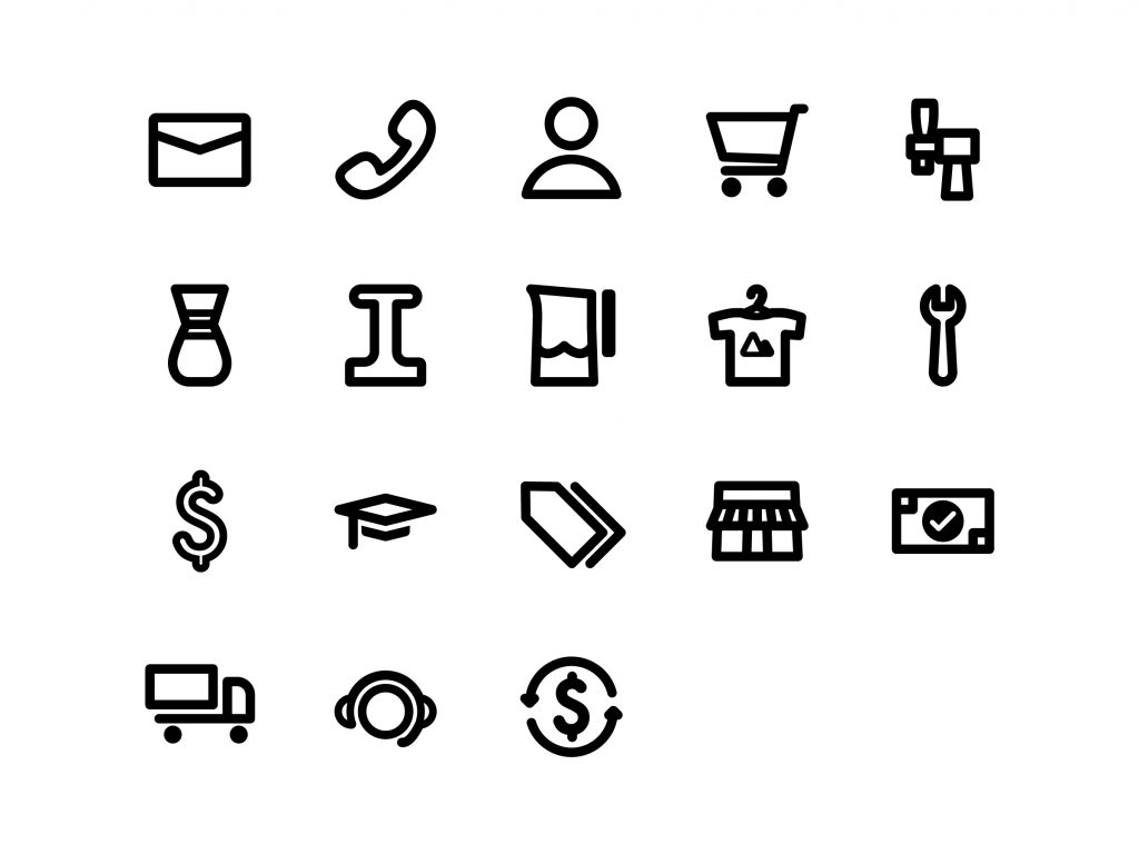
First Draft
This was my first proposal for the icon set. I thought it did a good job representing the products. It was created to be modern and simple. In the end it was clear that it didn’t accurately represent the Prima Coffee brand and wouldn’t work very well at smaller screen sizes.
See the icons in action here! And check out some other work for Prima here.